Washington Post Planning
2021 - Present
Project
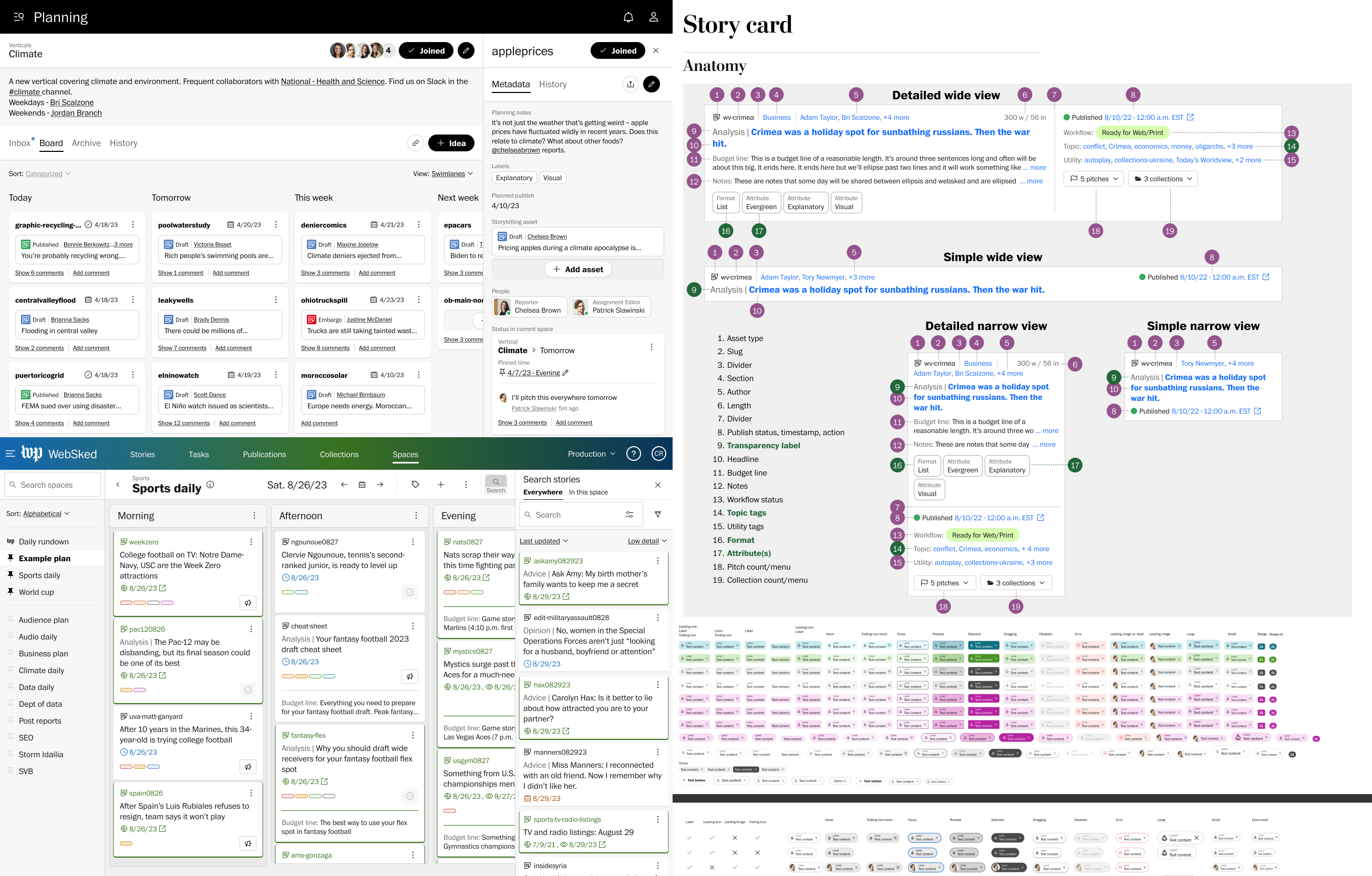
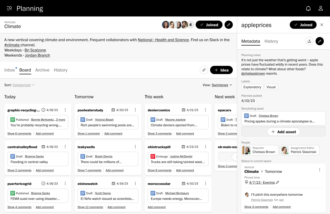
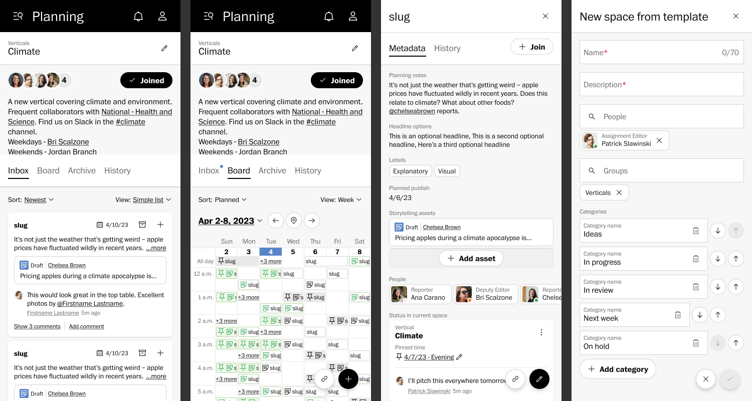
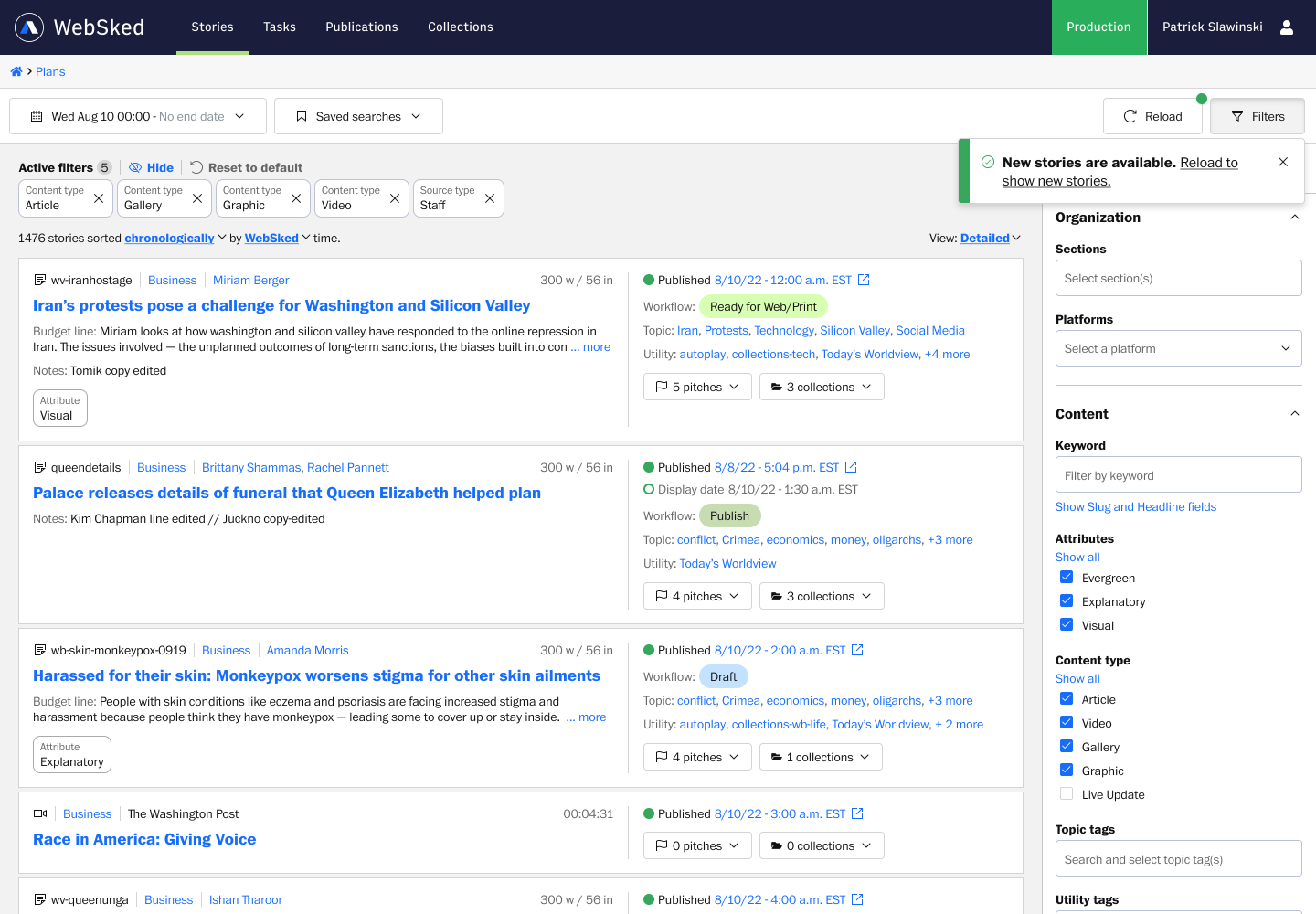
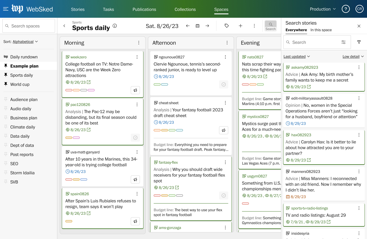
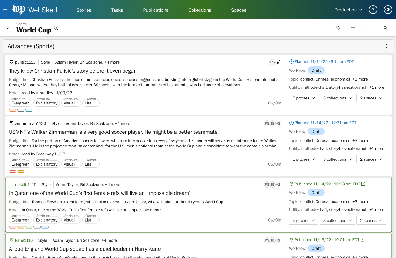
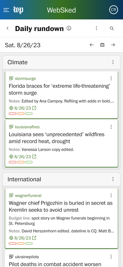
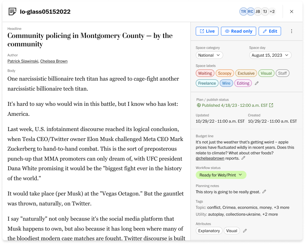
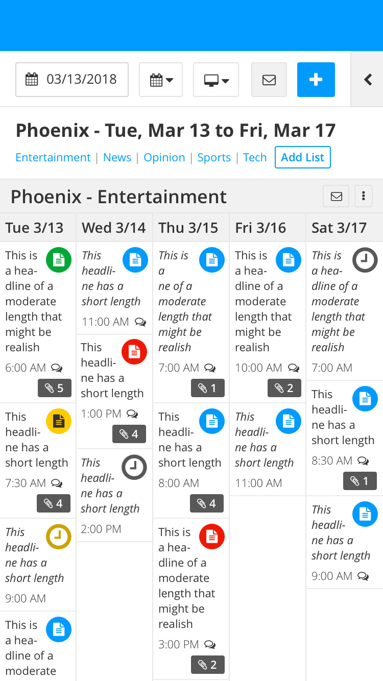
Newsroom planning at The Washington Post was a mess when I started researching the situation. Planning activities were spread across many different tools with different levels of access and transparency. Reporters and editors wasted time on redundant coverage and prime promotional opportunities were missed due to lack of visibility. The Post already had a custom planning tool, but it was meant for a simpler goal and hadn't been updated in years. My task is to update that tool to fit the needs of the newsroom today and into the future.
Work
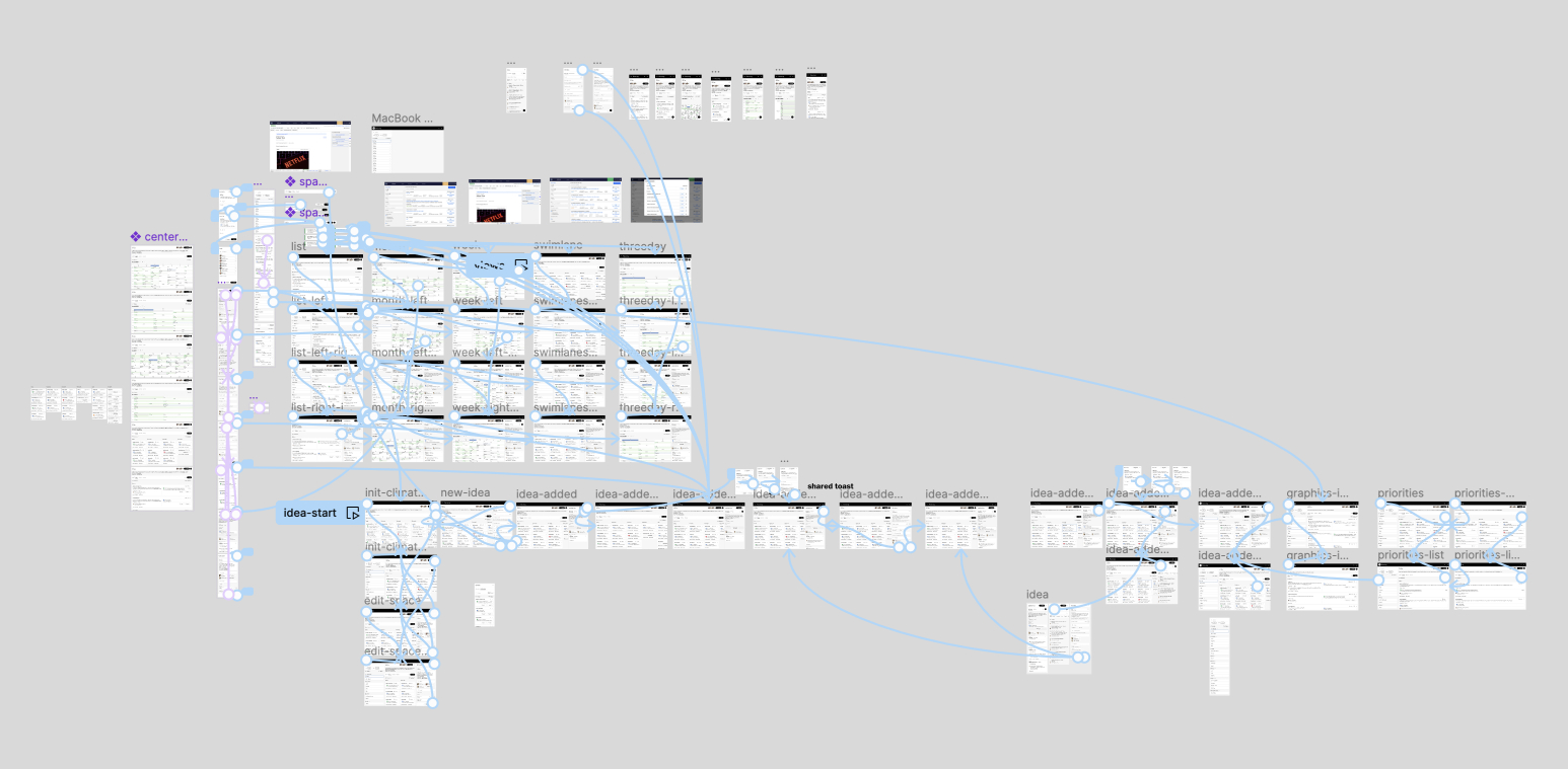
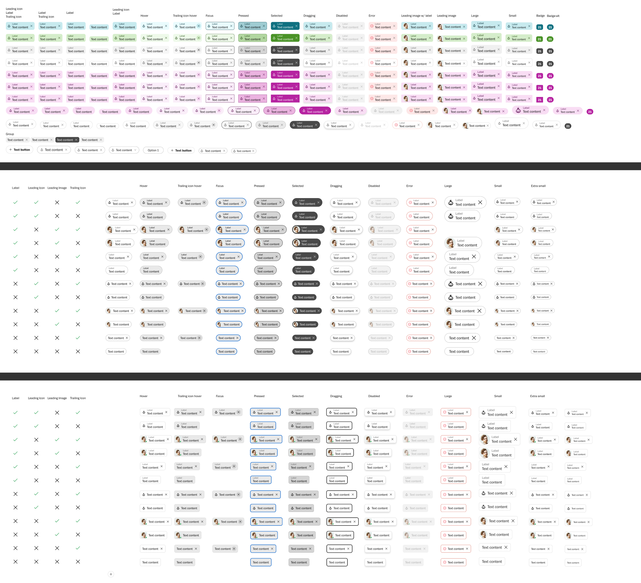
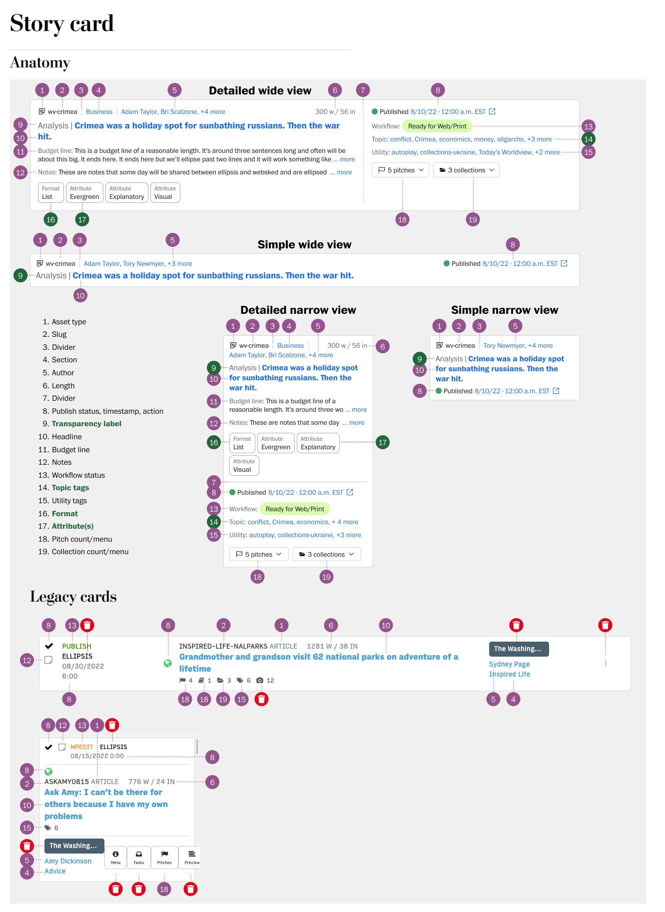
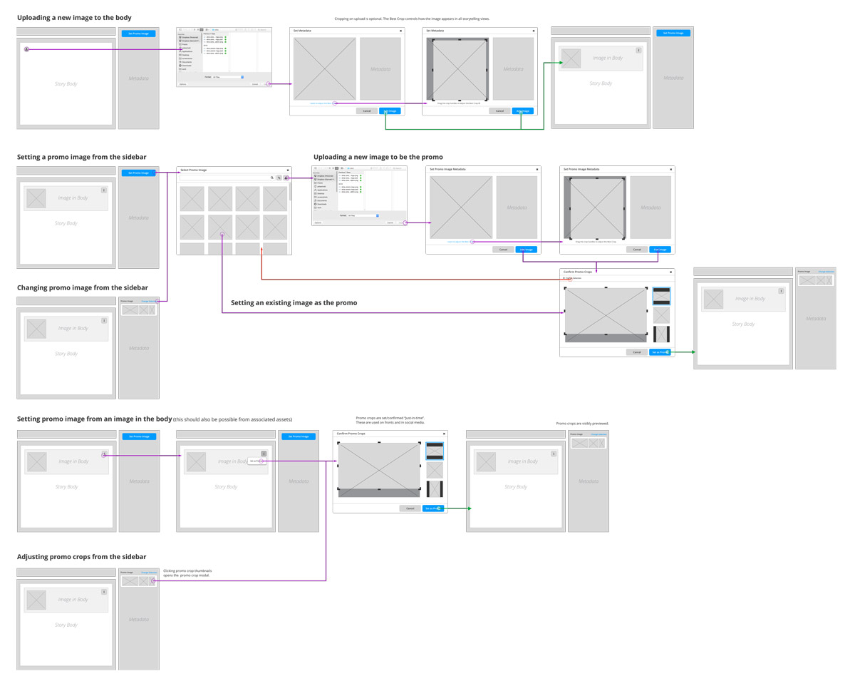
Following months of research into the newsroom's planning practices, I established a strategic direction for the future of the Post's planning tools. I wrote vision documents for review and organizational buy-in, then presented early work to the newsroom to see if I was on the right track. With my direciton confirmed and the newsroom excited for the future, I moved into high fidelity design and testing working toward a version one release.
Gannett CMS
2014 - 2021
Project
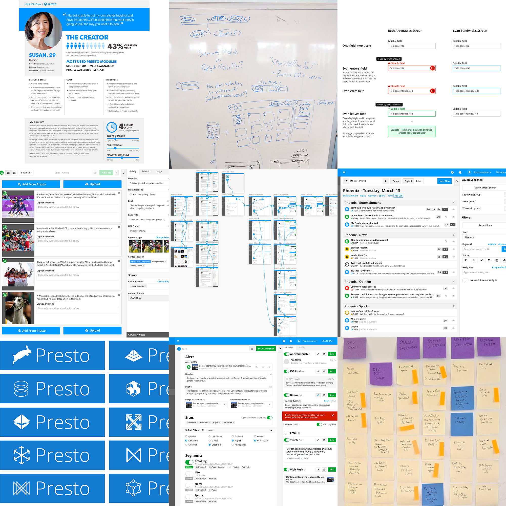
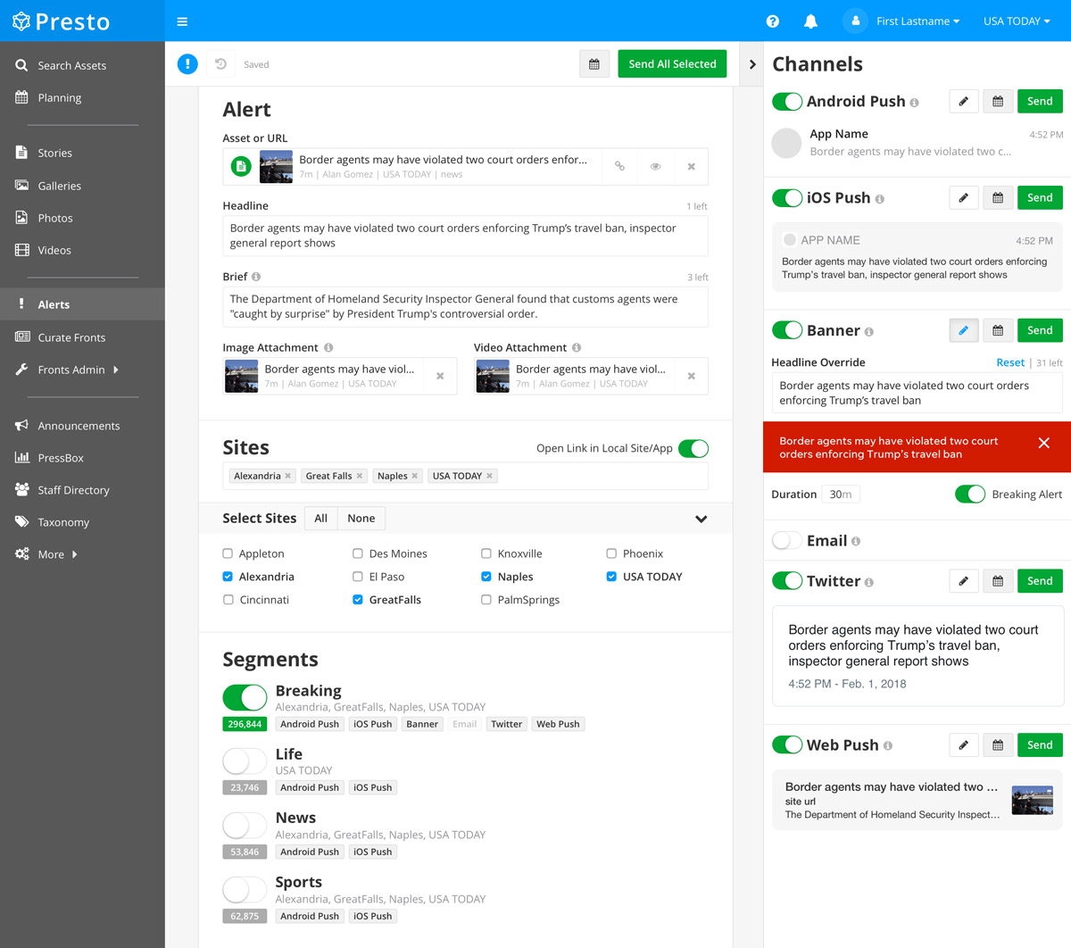
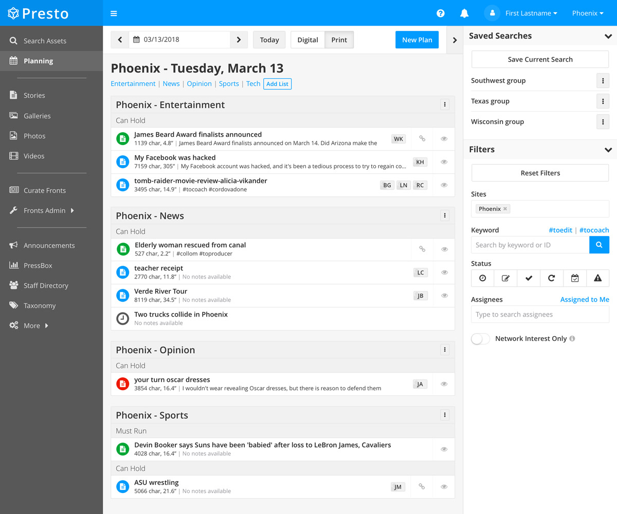
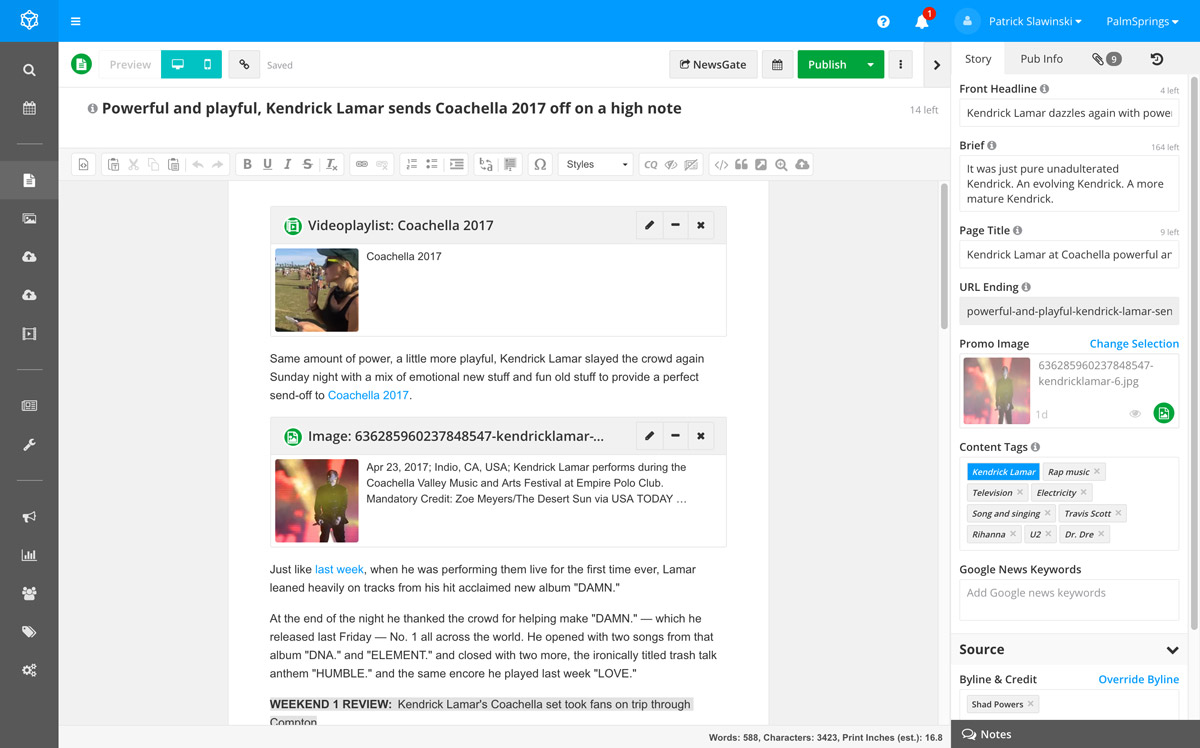
Gannett's custom CMS powers over 100 news sites visited by more than 100 million readers per month. Sites range in size from small local operations to the large national footprint of USA TODAY. The CMS enables cooperation and coordination across the network as editorial resources are shared across the country and content is seamlessly adapted across sites.
Work
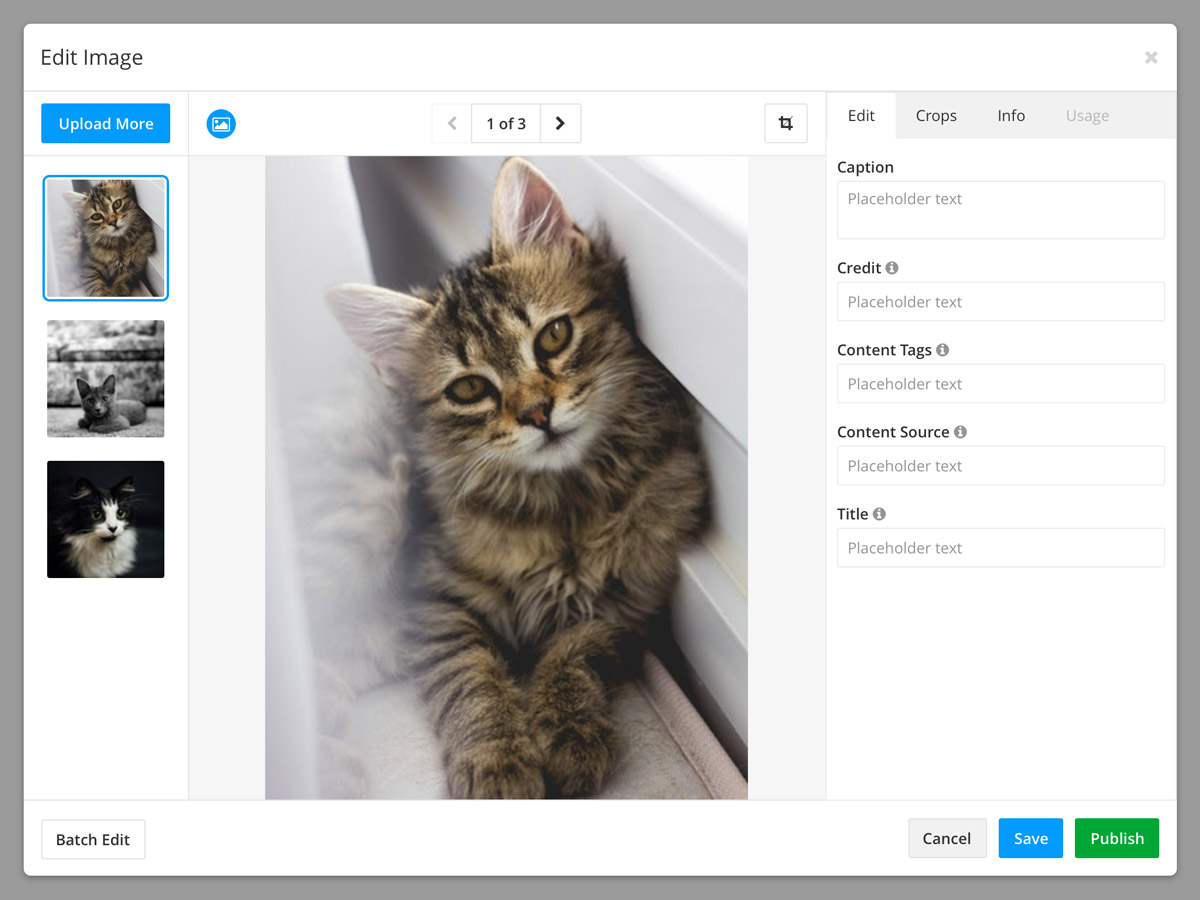
I was the lead designer for Gannett's CMS, shepherding the tool's user interface through a long transition from legacy technology platforms and front-end frameworks to the fully updated position it's in today. My work included: user interviews and surveys, persona creation, style guide development, prototype building, SASS stylesheet implementation, rebranding, working within Agile processes, and iterative modular UI design throughout.
The Wall VR
2017
https://www.usatoday.com/border-wall/usa-today-network-border-project-about-vr-podcasts-map/
Project
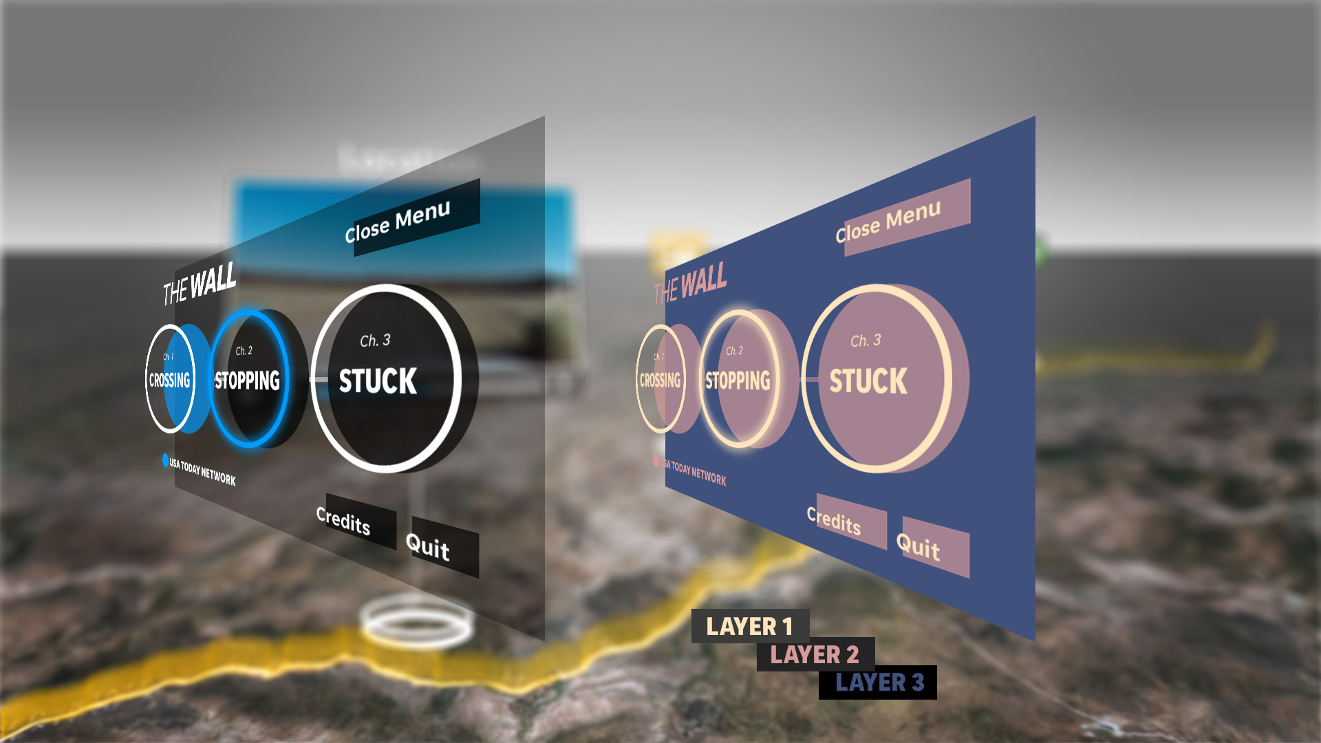
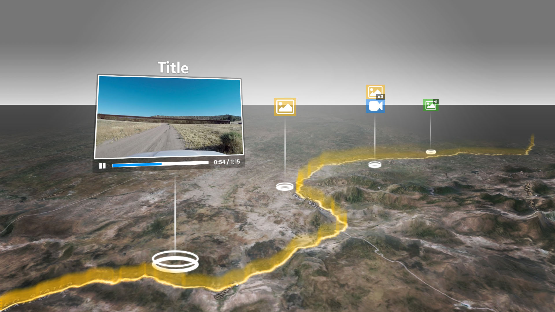
The virtual reality component of the 2018 Pulitzer Prize-winning USA TODAY Network report The Wall. This story brought together reporters, editors, photojournalists, designers, and developers from across the country to tell the story of life on the border between the United States and Mexico.
Work
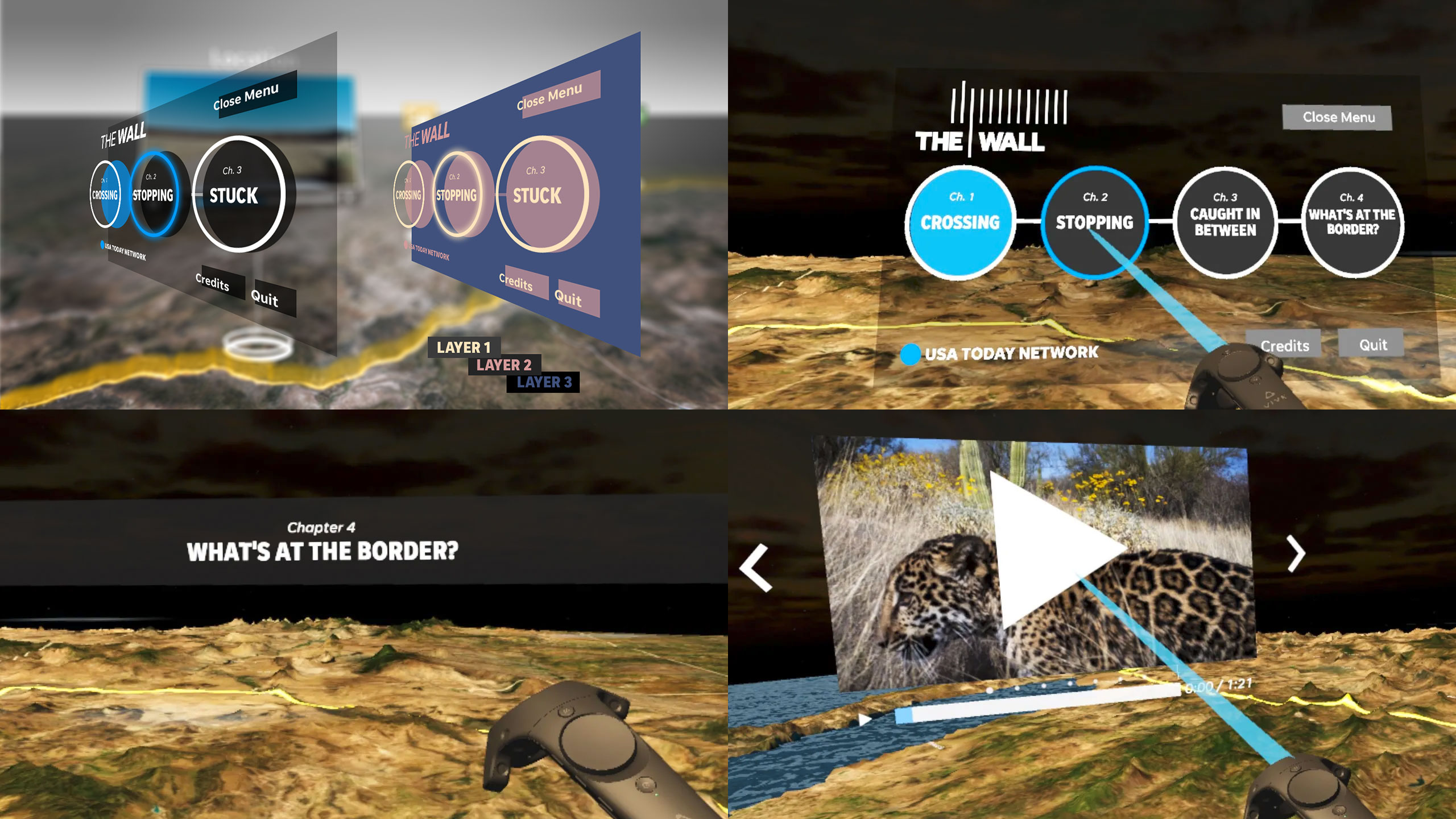
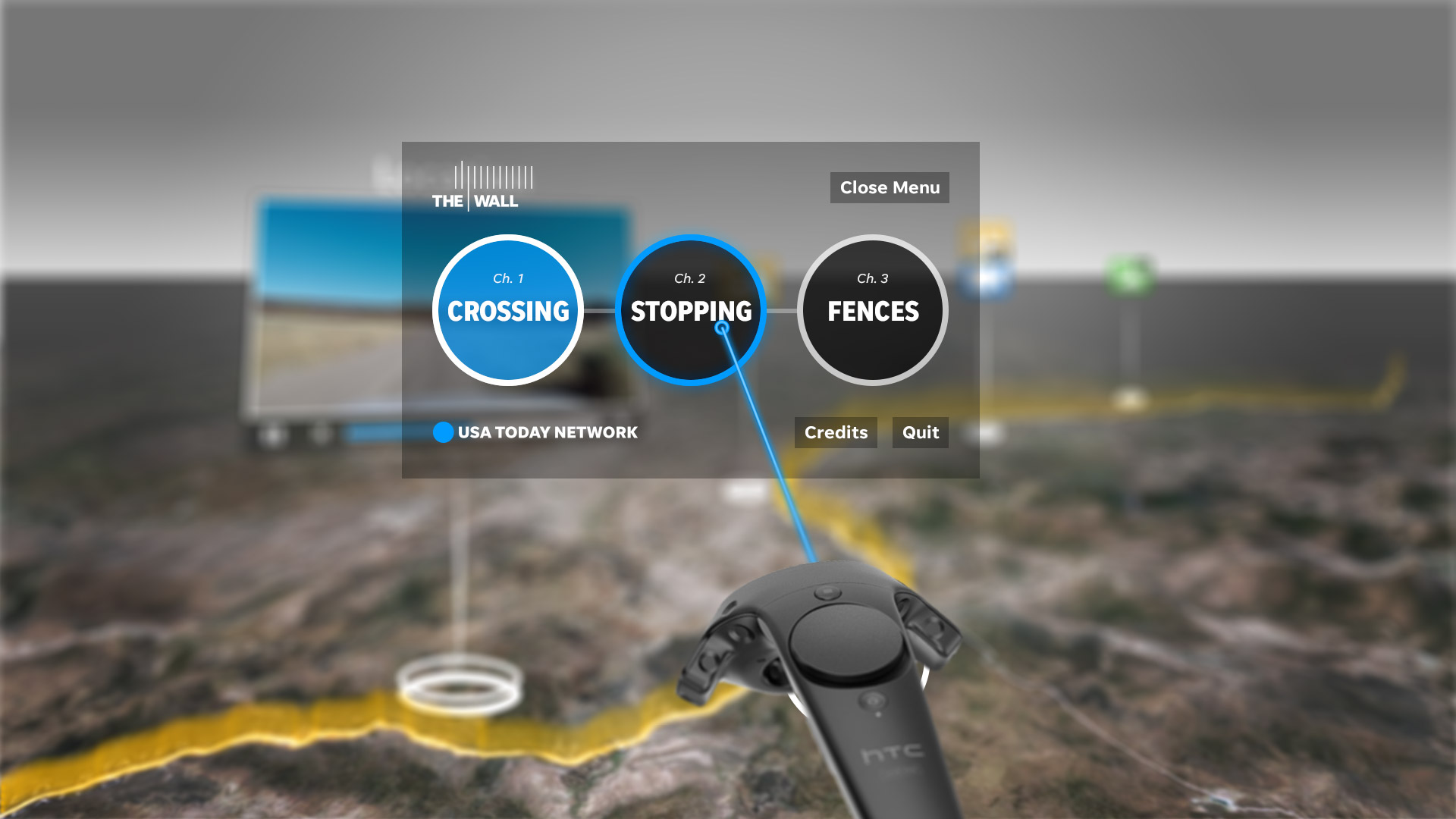
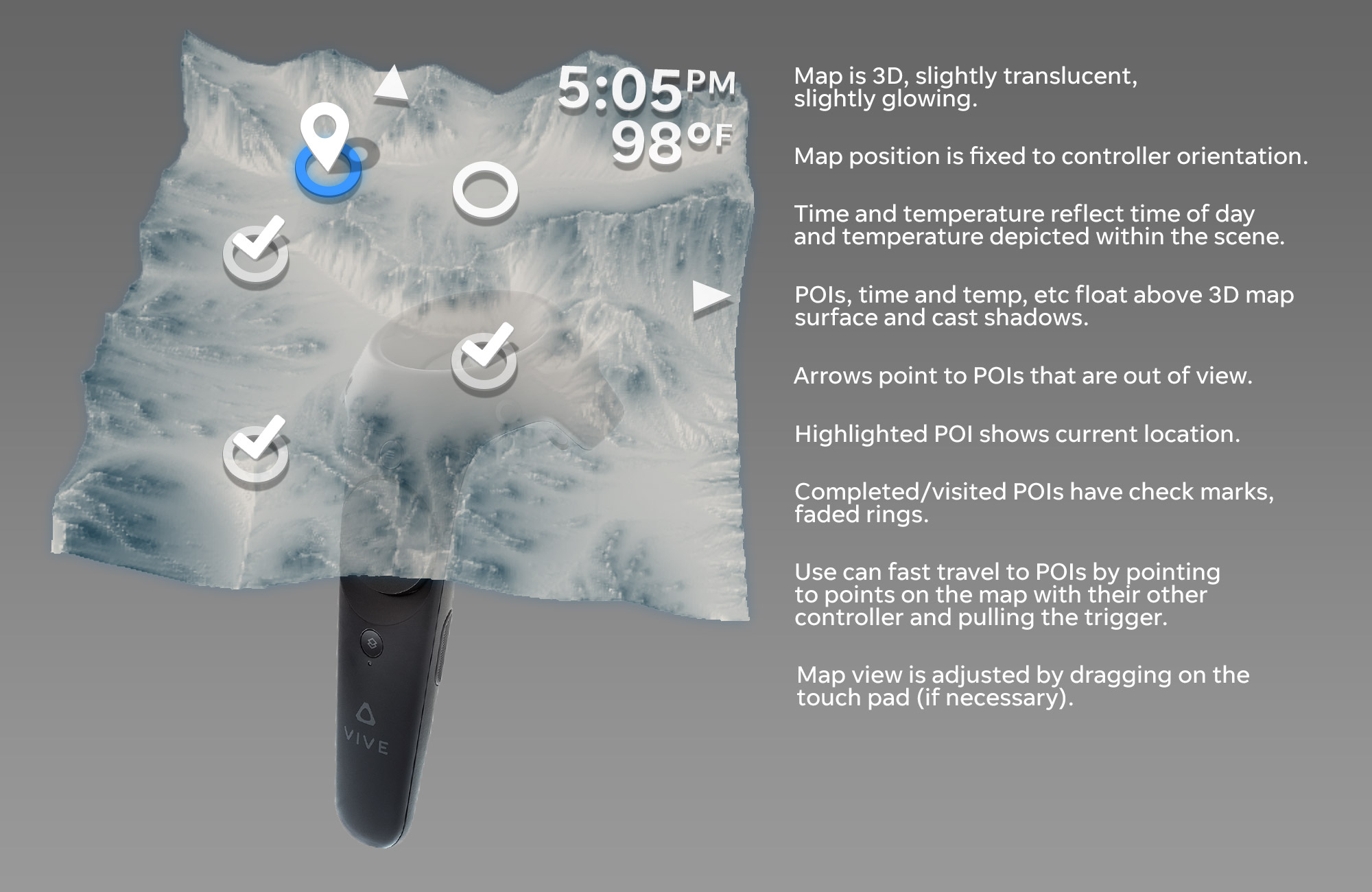
This project involved a lot of sketching and concepting to figure out how best we could tell a story given the expected content and technological capabilities. The team executed a successful experience through multiple pivots as reporting content turned out differently than anticipated. I focused on the user interface while also remaining deeply involved in the VR presentation of the reporting.
U.S. News
2012 - 2014
https://www.usnews.com
Project
U.S. News & World Report is an internationally known news publisher and producer of ranking lists.
Work
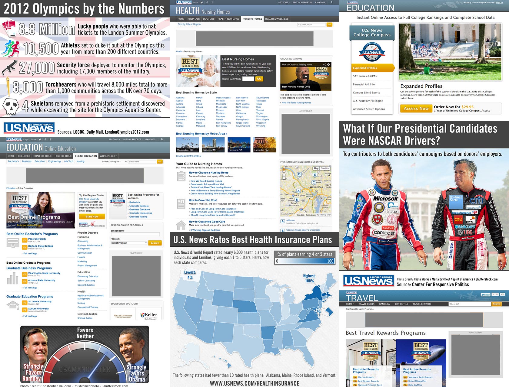
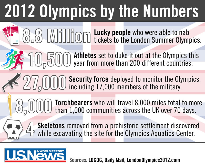
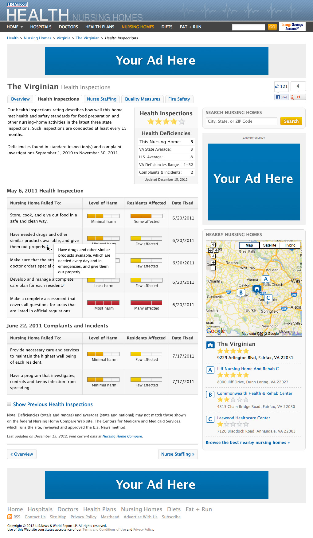
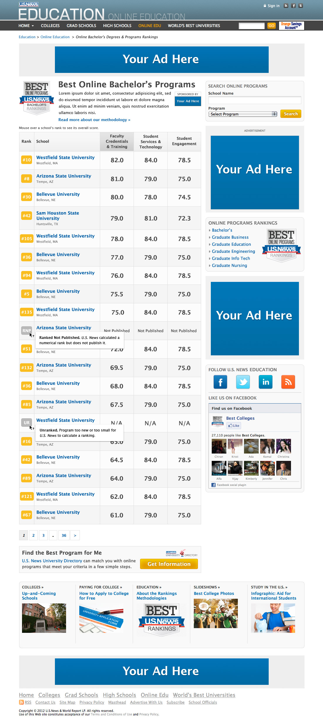
I spent two years at U.S. News as a Senior User Experience Designer. I collaborated closely with fellow designers, analysts, editorial staff, and engineers to help keep the success of U.S. News growing. My work with U.S. News involved every part of the site. I prototyped an updated header, footer, and site navigation structure. I created infographics, designed rankings pages, prototyped article templates, and created HTML/CSS buttons. I visually unified the U.S. News social media presence, designed advertising campaigns, performed usability tests.
Army.mil
2006 - 2012
https://www.army.mil
Project
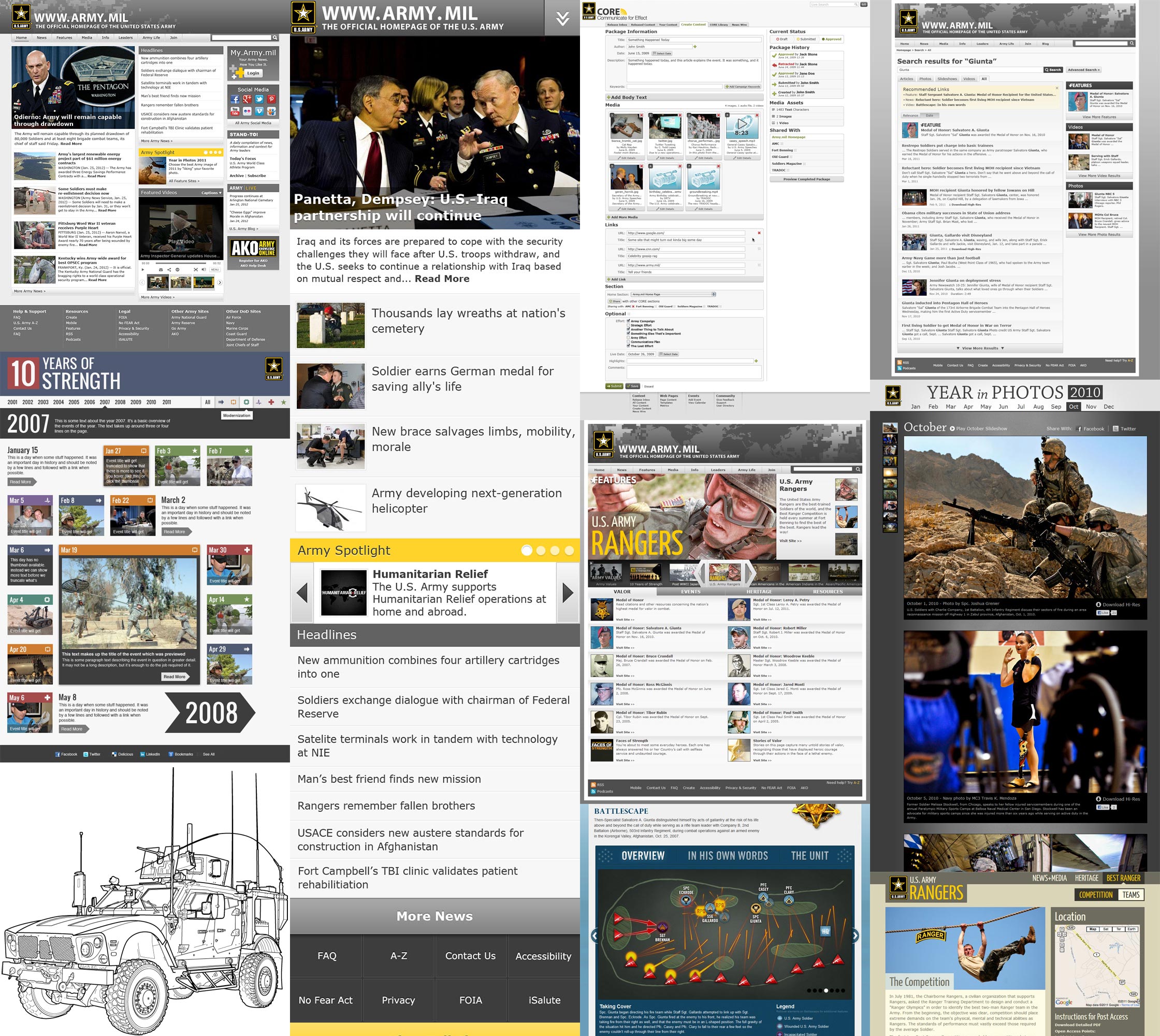
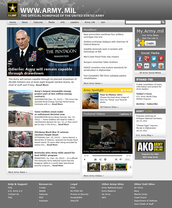
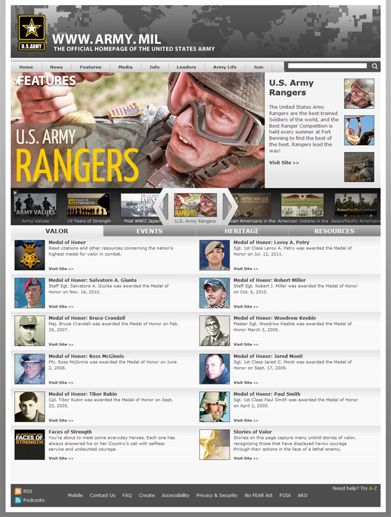
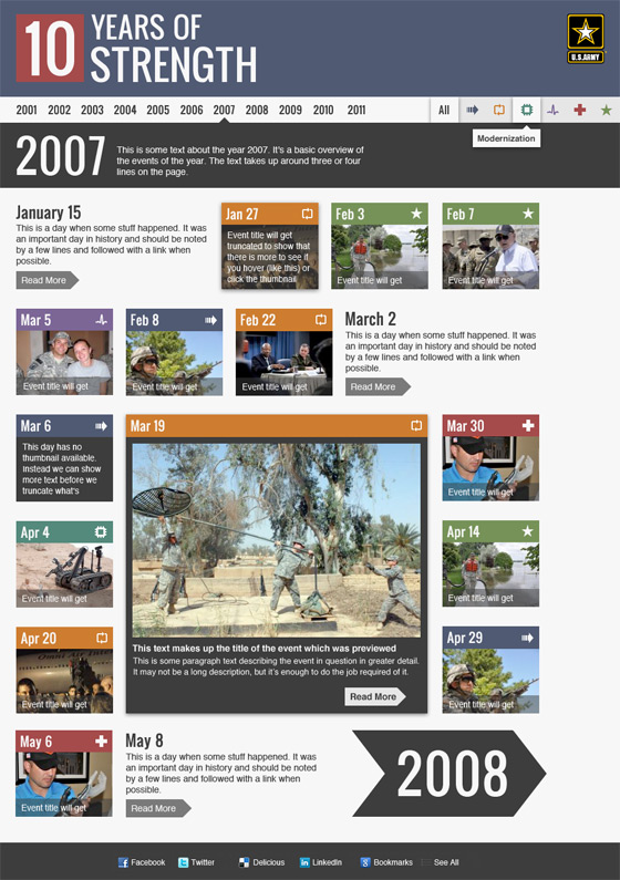
Army.mil is the news outlet of the United States Army's Office of the Chief of Public affairs. Beyond news, Army.mil regularly features special microsites around events, awards, and anniversaries.
Work
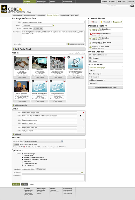
I worked my way from the bottom to the top of the Army.mil design team. My tenure included designing and building a multide of microsites as well as creating a shared home for said microsites. I led the design team and worked with clients directly. In addition designing countless microsites, I redesigned the home page, mobile article presentation, and search experience. I also led the design of the UI for Army.mil's custom CMS, an experience that would point me toward most the rest of my career thus far.
